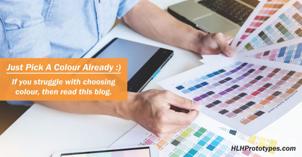
Just Pick A Colour Already :)
Colour, I love it, but some days I swear it will be the death of me. I deal with colour every single day, in graphic design, photography, branding, and in a previous life in 360-degree product development. I love colour, picking the right colour for any design or product is vitally important to convey emotion, trust, confidence, empathy, whatever message you are trying to get across to your customer colour will play a big part of your project’s success.
While it is important to get colour right, it is also something that can be drastically overthought at times. Sometimes the right colour is obvious and only takes a minute to pick. For some projects colour needs to go through a committee and decisions can drag on for weeks or months (been there, it’s painful). There is no magic answer to picking the “right” colour(s) for your design or product. A lot of colour knowledge comes through experience. If you asked 10 independent designers they will likely give you 10 different methodologies for deciding on the “right” colour. For today let’s not get bogged down in the theory of colour, colour fundamentals or colour psychology, that’s what Google is for. Instead, here are some practical tips from my past experiences with colour selection and project work.
1. The first step, take a colour blindness test to see if you have any colour deficiencies. I just took a test here and scored 100%, I still got it! Mini story, I worked on a project years ago where the project manager was colour blind and did not know it. This caused big problems on the project until we all figured it out.
2. When trying to choose a colour, whether it is on a computer screen or from a physical colour palette or reviewing real-world product samples, light matters. Don’t make final decisions if you are not able to review during the day in a natural light setting. If you are in a room with no windows or poor natural light then change locations. View and review colour under different light sources to understand how a colour looks in different situations, but make final decisions with natural light.
3. As mentioned above make final decisions on colour during the day, but more specifically early in the day. As the day progresses our eyes get tired, as our eyes get tired we lose our ability to differentiate between shades of colour properly or even make basic colour decisions the way that we can earlier in the day. Men, in particular, have a harder time with this. Mini story, I am writing this blog at night but I am choosing my blog graphic colours in the morning specifically because of this.
4. We always want to pick the best colour possible to help convey our message or style. But it is important to remember how you are presenting your colour choice to your customer. This will help guide you on how important your pending decision is. If your colour decision relates to a product that might live in the world for years then your decision is important. If you colour choice relates to a single social media post that will likely live in the moment or for a few moments, just pick a colour already, it’s not a life and death decision 🙂
5. If you struggle with picking colours then lean on online resources to help you. Particularly if you are working on a design or product that requires multiple colours working together. Sometimes complimentary colours will work, sometimes contrasting colours will work, if you really have no idea where to start you don’t always have to start from scratch. There are many real-world examples you can borrow from for inspiration, so borrow. There are many online resources you can borrow from, so borrow. Here is one online resource to borrow from.
6. In the digital world, you can do anything, any design, any colour, any concept. If you can think it and you have the right digital design skills you can make anything possible. Unfortunately, your creativity does not always translate if you need to make a physical object. The same goes for how colour works in the physical world compared to the digital world. Different wavelengths of light will affect how a colour looks. Surface texture can affect how a colour looks. A polished or matte finish can affect how a colour looks. Point being, get off paper early when choosing colour for physical objects because you really need to test several colour options and surface finishes on physical samples as early as possible to help avoid delays later on.
7. When making a product remember that your manufacturing partners don’t know what “bright red” is. They work with Pantone colours, which is a universally accepted colour identification system. This means that as early on in your creative process as possible you should also be designing with and making decisions around Pantone colours to match eventual manufacturing needs. Staying with manufacturing, part colour needs to be quality control checked throughout the manufacturing process to ensure consistency. You get what you inspect, not what you expect.
8. If you feel like your colour decision-making process is taking too long, then your colour decision-making process it is taking too long. Here is a mini story for you. I worked on a keyboard project years ago, a kids keyboard, for one of the biggest companies in the world. it took 3 months to pick a shade of yellow. I mean come on man, you are a multi-billion dollar company, with seemingly unlimited resources and talent, make a decision already. The delay pushed our suppliers right up to and past the shipping deadline. It cost us profit, it cost our suppliers profit, it cost our customer (the 3-month decision-making customer) profit. That final shade of yellow? I promise you it made no difference to the success of the product compared to the other 3 almost identical, and I mean practically indistinguishable shades of yellow, that made it to the final four. My point is unless you are a very large company you simply can’t afford to wait that long and absorb delays. Better to stay on schedule and Just pick a colour already 🙂
Colour is important and if choosing colour is going to be part of your job I do recommend that you take some time to learn the basics if you don’t know already. Here is one resource to start you on your journey. It is also important to remember the tips above and to formulate your own strategies around picking colours…and remember, if no decision on colour is slowing your project down, just pick a colour already 🙂
Gary Moran
At HLH, we make things for you. FreeQuote@HLHPrototypes.com
